0 Comments
I've been wanting to write this post for a while now. I love watching TV but what I like more than watching TV is watching TV advertise itself. The way a channel is perceived by viewers has as much to do with the programmes themselves as what surrounds the programmes i.e. idents, commercials etc. I think these things can often be overlooked yet they play such a crucial role in dictating who the channel is aimed at before a programme even reaches a viewer. So here I thought I'd look back at some of my favourites. Enjoy!
IDENTity
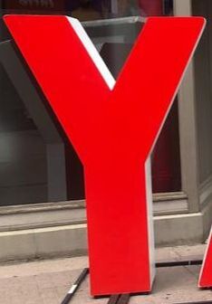
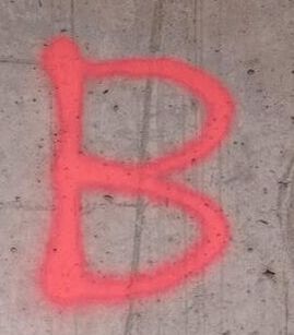
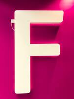
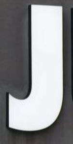
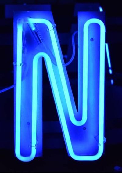
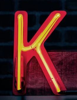
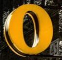
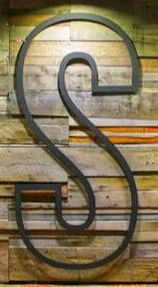
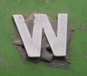
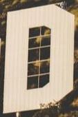
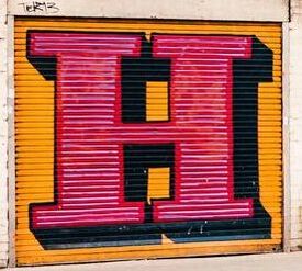
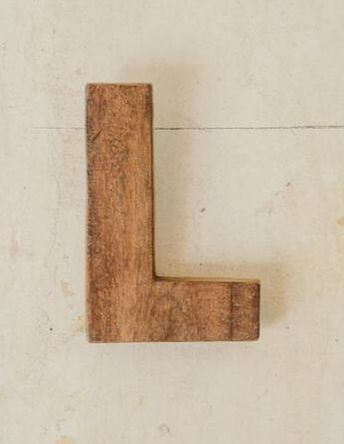
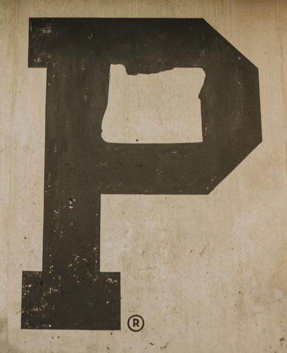
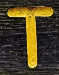
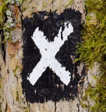
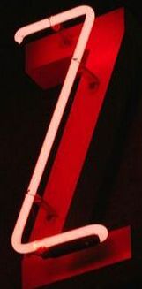
Let's start off with some type: every week since January 2019 a new artist has designed an ident for ITV and I just love this idea. The categories explored include motion graphics, fine art, upholstery and model making to name just a few. I really like the platform this has provided to not only independent artists but also charities and groups of people who are unlikely to have had such exposure on a national scale before. Although this idea feels 'borrowed' from Superunion's rebrand of the BBC 2 idents in 2018, in terms of such variation for one channel's graphics, the way in which ITV have shown the process of the artist's work alongside the finished outcome in such a succinct way has surely taken this idea to the next level. Below are just a few of my favourite idents since the project started:
Here's an interesting article about how ITV idents were rebranded to tie in with this project:
https://www.maxon.net/en-us/news/case-studies/broadcast-motion-graphics/article/itv-gets-creative-with-cinema-4d-and-redshift-1/
And Superunion's BBC2 ident revamp for reference:
SO HOW ARE THE CHANNELS ADVERTISING THEMSELVES?
At the beginning of last year I saw an ad I thought was really clever. Aside from the fact that I'm a die hard Vera fan, there are many reasons why this recent ITV campaign is a good one. During the ad, DCI Vera Stanhope makes a direct address to viewers at home discussing what makes her who she is and contemplating why we like her so much. Made by Uncommon Creative Studios, this ad was part of a campaign designed to make 'light viewers', i.e. those who perhaps aren't that invested in a programme, re-evaluate the significance that these characters can have beyond the screen within our everyday lives and in the words of ITV's Chief Marketing Officer "demonstrate the emotional power of our content". Although breaking the fourth wall is a rare occurrence in any fictional TV programme, the convincing soundtrack, cinematic shots and authentic dialogue make it a really successful effect. And in using this effect, we are invited to no longer be an observer of our favourite character but actually engage in a one way conversation with them, reminding ourselves that good characters are the reason we choose to watch a programme. I'm sure ITV are under more pressure than ever to compete with streaming services like Netflix and Amazon Prime but this ad quickly gets to the bottom of our motivations to invest our time in programmes and this is why I think the ad is so successful.
'Complaints Welcome' by Channel 4's in-house agency 4 Creative is another original campaign for promoting the integral values of a channel. The advert consists of people and characters from a variety of Channel 4's programmes reading out genuine complaints that have been made about them by members of the public. Released in August last year, Channel 4's Director of Programmes Ian Katz has said the campaign was designed to challenge "the way our viewers think about the world" adding that he would be worried if someone wasn't complaining about one of their shows. I really admire this approach by Channel 4; I feel that promoting healthy debate is critical within society today more than ever. It's so important that no one is denied the right to their opinion and that discussion of the topics raised as well as many more can remain open and accessible to everyone. I am not necessarily saying that I agree with the complaints that have been made in the ad but agree with the principle of letting everyone's voice be heard. In allowing people to express their point of view, we are opening up a topic so that we can hear angles of an argument that we may not have considered before. I see this campaign as being Channel 4's acknowledgement as such a large platform to do this in a responsible and meaningful way.
LET'S END ON A THROWBACK...
For me, ITV's creativity stands out more than any other channel for their in-house commercials. I trawled through the archives to find this one which promotes their upcoming dramas and has to be my all time favourite. Created in 2012, it was released at a time when the channel had some big changes going on internally; they were dropping the number '1' from their flagship channel. There were also some big staffing changes at ITV creative, the combination of which I think led to the beginning of an exciting new creative direction for the channel. Chosen to 'create a logo that could "live" in three dimensions' was New York based designer Craig Ward. Commenting on how he came up with the idea Ward said: "The idea of 'drama' always makes me think of black-and-white films, and long shadows like in Hitchcock - so I suggested we try and create something simple and tonal using just light and shadows to define the type". One of the best things about the typography from my point of view is that the combination of typefaces in such an elegant way means Downton Abbey sits comfortably next to a crime drama and this must have been a difficult thing to achieve yet it has been done in such a clean and simple design. The words "Drama Lives on ITV" were laser-cut from wood and built as an 8x5 foot model then hand-painted white. Although Ward said it would have been much easier to make on Cinema 4D, the brief required something to be physically made which gives the type small imperfections resulting in character which is what the ad is all about.
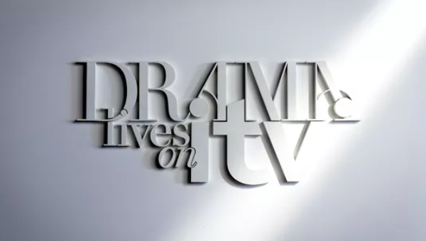
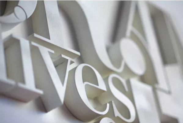
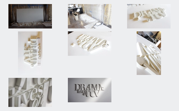
Pictures courtesy of Creative Bloq/Craig Ward
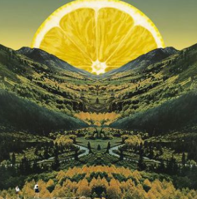
And a couple more...    Adobe A N I M A T E SKILLSHARE: 'Basics of Hand-Drawn Animation' by Johannes Fast: YOUTUBE: https://www.youtube.com/watch?time_continue=150&v=3iXSQ8VcPcU&feature=emb_logo Adobe A F T E R E F F E C T S SKILLSHARE: 'Learn Adobe After Effects CC for Beginners' by Jordy Vandeput: YOUTUBE: https://www.youtube.com/watch?v=RqKdS3wxkZ8 - shows you how to do basic coding to create a realistic bounce effect. This latest ad from Adam and Eve DDB feels really fresh and certainly blows the lockdown cobwebs away. As one of my favourite agencies, I wasn't surprised when I found out Adam and Eve had made this ad, their originality is consistent and this appears another masterpiece to add to their collection with a string of successful John Lewis Christmas ads already under their belt. This ad doesn't feel like it's associated with a car- related brand yet the zesty lemon walls are unmistakably AA colours and give the whole piece a warm and vibrant feel. The style of the ad has really been well thought through; Tukker the dog could have easily been a real-life canine actor like so many previous ads yet a handmade puppet has been used to create originality despite the ad mimicking the 1979 Maxwell's casette tapes ad. The soundtrack pulls all elements of the ad together effectively, really giving the viewer a feeling of driving with the window down on a sunny day- a great sense of escapism is just what's needed in the current climate. Good dog, great ad. 10/10. Recently released for startup energy company Bulb, it's difficult to find fault with an ad containing a talking unicorn called Terry. Bulb have certainly helped themselves by using a bright pink backdrop which immediately distances themselves from the more traditional ads of energy companies. Ads today seem to have so much unnecessary 'background stuff' going on so the clean backdrop for these ads really focuses the viewers attention on what is being said i.e. the brand message. The voiceover also lends itself well to this ad, aimed at the average consumer, by giving the impression of being an ordinary 'Terry', albeit one who is a unicorn. Oli Beale, Executive Creative Director at the time for the agency who created these ads - Anomaly - said "I hope these don't feel like energy adverts because energy adverts are generally crap". And with the exception of EDF's orange blob, I would wholeheartedly agree with him. With the creativity shown in an industry that's well known for its lack-lustre ads, its not difficult to see why Bulb is the fastest growing energy company on the market. 8.5/10.
Not a particularly recent ad but a firm favourite of mine due to the ginormous inflatable dinosaur. All credit to BBH, the warm summer vibes given off from this ad provide the perfect antidote to the cold winter weather when this was released in November 2016. For me, a good advert is not necessarily about the content but rather how you feel when watching it and this ad made me feel like I was at the best pool party this side of Ibiza. Surprisingly, the dinosaur is not someone in an inflatable costume as I initially thought which is testament to the incredible VFX skills of The Mill. The only dampener I'd put on this party is the disappointing voiceover at the end. J2O themselves have said they are a brand targeting the 25-35 year old market so I would question why they chose a voiceover that would be more suited to announcing train times at Waterloo. This is the only thing that kills the otherwise cool vibe so all in all a solid classic. 8/10.I'm the annoying person who takes coins out of circulation. I started collecting them when I was 11 or 12. At the time, a friend of mine was collecting stamps and I wanted something similar I could collect, rearrange and proudly show off in a cheap plastic folder from WHSmiths. I didn't think my enthusiasm would last long; a few years earlier I'd shown a blatant disregard for my sticker album after a few months, so I don't know why I thought collecting coins would be any different. But once I started looking for designs, I became more and more preoccupied, checking every handful of change I had. It's become slightly addictive and I owe half of my collection to my mum who has become just as invested as me in finding a hidden treasure. 10 years later and my collection is still going strong. In terms of monetary value I'm sure its not worth much more than the value of the coins themselves, but to me it's priceless because whenever I'm lacking creative inspiration, I can look through it to see beautiful designs in tiny spaces. Here are some of my favourites: 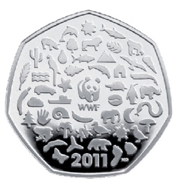 I bought this coin from someone one weekend at my local Music Centre. It was 2011 when the coin was newly released and desperate to nab one while it was still hot of the press I paid £1, sacrificing my Saturday Crunchie for a small piece of brilliant design. (Little was I to know that I would find two in my own change not long after). I love the intricacy of this coin; the way in which all the shapes lock together in a heptagonal mosaic could be seen to work as a metaphor for WWF, highlighting one of the charity's aims of preserving thriving, interdependent ecosystems. Most commemorative designs seem to be big and bold so I like the contrast this one offers where you have to examine the coin carefully to fully appreciate the different elements which combine to make the charity. Designed by Matthew Dent, this 50p is a firm favourite in my collection. 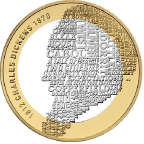 Another design by Mathew Dent, this £2 coin was released to celebrate the 200th anniversary of Charles Dickens birth. I like this coin for a number of reasons. The first being something that many coins seem not to have: negative space. The space around the silhouette allows this design to breathe which is rare for coins where many seem to have every spare centimetre filled with pattern. I like that the illustration has been approached in a typographic way and I particularly like the variation in type sizes which creates differing emphasis of the facial features. The only thing I might have changed if this was my own design is to tie the neck in somehow as the whole head appears a bit 'floaty' without a body attached to it. 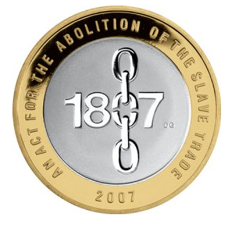 A different style of design and a different designer; David Gentleman produced this £2 coin released in 2007 to commemorate 200 years since an act was passed for the abolition of the slave trade. I particularly like this coin because the design is approached typographically rather than illustratively. Often the simplest designs are the most successful and I think that is particularly true of this coin. The break in the chain through the 1807 '0' is subtle but conveys the meaning perfectly and the negative space around the text allows for a clear focal point. I wish more coin designs were approached in the same way as this one; although I really like the previous two coins I've discussed, their designs seem a little busy and I think in that respect, the design of this coin conveys its meaning more effectively.
PAPER - Some advice I found helpful on what ink to use: https://www.lauraboswell.co.uk/res-ink.php (and a comparison test): https://www.lauraboswell.co.uk/ink-test.php FABRIC - Some advice I found helpful on what ink to use: https://handprinted.co.uk/blogs/blog/how-to-block-print-with-lino-onto-fabric On printing with two colours (and the design is really nice too): https://www.ellenvonwiegand.com/single-post/2015/02/19/The-Making-of-a-Two-Colour-Linocut-Print Other Inspo: http://linocutboy.com/ https://www.sammarshallart.com/sam_wp/linocuts/ https://www.shukhova.com/linocut https://www.instagram.com/rose_agar_designs/?hl=en
 Recently, I've noticed a number of ads that have chosen animals as the face of their brand so I thought it only right to review the furry (or not so furry) friends featuring. The first thing I wanted to talk about is the ad 'Morning Ritual' by Joint, London for a partnership between Amazon and RNIB. To be completely honest, the first time I saw this ad I felt very guilty for my initial reaction to the first 20 seconds. A lady wakes up and asks Alexa what time it is; *yawn* I thought- is this the best they can come up with? So it wan't until I heard the jingle of a dog collar and saw the guide dog that I realised what a cleverly crafted and well thought idea this ad was to show just how helpful the Amazon Echo can be. It made me realise how I can take the ability to complete the simplest everyday tasks for granted, and I'm sure I can't be the only one who does. I think the integrity of this ad is what makes it so poignant; the whole production conveys the narrative beautifully and makes it feel like you're watching a 60 second piece of cinema. Second up, it's the campaign, 'Hope is Power' by Uncommon Creative Studio. The Guardian have a lot to compete with when it comes to newspaper advertising; the New York Times/Droga 5 campaign 'The Truth Is Worth It' and The Times/Pulse Creative 'Politics. Tamed.' ads certainly both gave the Guardian a run for its money when they were released earlier this year. What stands out from this ad however is the absence of noise which is present in the two competitor ads. Both liberally use typography and voiceover (respectively), so what's particularly refreshing in this campaign is the comparative silence. The imagery within the picture and lyrics within the echoed vocals is enough to convey the meaning of the brand message. The aspect ratio combined with camera angles and focuses make for a captivating cinematographic 60 second watch. The only thing I would make slight criticism on is the end tagline. I think the first line 'Change is Possible' is acceptable but I think the next part 'Hope is Power' is too weak, both phonetically and in terms of meaning. 'Change is Possible. Knowledge is Power.' is a suggestion I would make to give the final punch to this ad more strength in communicating the overall brand message. After two rather poignant and thought-provoking ads, I thought I would end on a lighter note with the unlikely friendship struck up over a cuppa between a congenial cat and her canine companion. Made by Spark 44 for Tetley, the traditional 'Tetley Tea Folk' characters have recently been axed in favour of something that might perhaps appeal more to the modern day tea drinker. Although the lovable Tetley Tea Folk characters were, for a long time, the face of the brand, I agree that it was time for a face lift. The result; swap fictional humans for real-life pets and you've got yourself the next Tetley campaign. On first watch I didn't get a strong sense of identity and found myself wondering which brand this was for. The ad itself has a strong likening to Mother's 2011 'ahh' campaign for PG Tips (a humanised animal makes a cup of tea whilst it pours down with rain outside). But if I look past the conventional tea-brand context and examine what this ad does have going for it, I get to the humour. I'm sure after this ad went out there were pet owners up and down the country wondering if their wiry-haired terriers are miserable on walks and just want to get home quickly for a cup of tea. Whilst this is most likely not the case, it's certainly a humorous conversation starter and I'm sure has helped Tetley during the somewhat precarious period of rebranding. Going forward, I would suggest developing these two characters by making them more personable; we know their sense of humour so let's now get to know them- what are their names, hobbies, interests, backgrounds etc. This could help make them more relatable which in turn could grow the persona of the brand Tetley are currently nurturing.
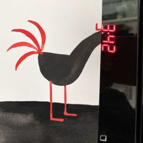
This week, I've chosen a throwback to one of my favourite ads which scores 11/10 for originality. The brief for this campaign was to relaunch the First Direct brand to a new, younger audience of 25-34 year olds. First Direct could be described as a trend setter; in their own words they are 'the pioneers of easy banking'. Launching their phone banking in 1989, they were over 20 years ahead of emerging banking brands like Monzo, formed of similar principles and practises. Being the original non high street bank, it's not surprising First Direct wanted a slice of this rapidly expanding market with a new ad targeting a younger audience. I think the ad works well because after a couple of watches it appears to be jam packed with subtle metaphors, all designed to gently coax the target audience into seriously considering what this brand has to offer. Barry the Platypus himself is a great mascot in conveying the brand's message. Without shouting about how good First Direct is for him, his slightly unusual but still recognisable appearance, his familiar voice and easy going manner work really well in representing what the brand stands for.* Similarly, the bird that's been morphed into professional beat boxer adds a great deal to the brand's subliminal messaging. Although the idea of a small, feathery beat boxer is quite novel, it doesn't feel gimmicky to watch but rather natural and authentic perhaps conveying First Direct's concept as something that's a credible option in the long term despite the nature of the bank not being typically conventional. However, although this ad does have many respectable attributes, the one thing I initially questioned was the evident lack of colour. I don't believe the use of black and white detracts from the ad itself but the opportunity for use of colour with the vinyl shop and the graffitied canal walls featuring could have created a new dimension to the narrative. Perhaps the decision was made for the monochromatic palette as a way of alluding to the straight forward nature of the brand. Or perhaps in an age of photo filters and colour enhancing, the tone was called upon to get away from what might usually be expected of an ad being shown through todays channels. Either way, it's clear a lot of creative thought went into this ad and the result is a rejuvenated brand image which no doubt attracted a broader range of customers to bank with it. *Talking of Platypi, did I mention I manage the social media activities of the only platypus known to be living in the UK. Check out Patti's account and give her a follow: www.instagram.com/patti_the_platypus/ |
AuthorAlex Charnock Archives
December 2020
Categories |


 RSS Feed
