|
I've been wanting to write this post for a while now. I love watching TV but what I like more than watching TV is watching TV advertise itself. The way a channel is perceived by viewers has as much to do with the programmes themselves as what surrounds the programmes i.e. idents, commercials etc. I think these things can often be overlooked yet they play such a crucial role in dictating who the channel is aimed at before a programme even reaches a viewer. So here I thought I'd look back at some of my favourites. Enjoy!
IDENTity
Let's start off with some type: every week since January 2019 a new artist has designed an ident for ITV and I just love this idea. The categories explored include motion graphics, fine art, upholstery and model making to name just a few. I really like the platform this has provided to not only independent artists but also charities and groups of people who are unlikely to have had such exposure on a national scale before. Although this idea feels 'borrowed' from Superunion's rebrand of the BBC 2 idents in 2018, in terms of such variation for one channel's graphics, the way in which ITV have shown the process of the artist's work alongside the finished outcome in such a succinct way has surely taken this idea to the next level. Below are just a few of my favourite idents since the project started:
Here's an interesting article about how ITV idents were rebranded to tie in with this project:
https://www.maxon.net/en-us/news/case-studies/broadcast-motion-graphics/article/itv-gets-creative-with-cinema-4d-and-redshift-1/
And Superunion's BBC2 ident revamp for reference:
SO HOW ARE THE CHANNELS ADVERTISING THEMSELVES?
At the beginning of last year I saw an ad I thought was really clever. Aside from the fact that I'm a die hard Vera fan, there are many reasons why this recent ITV campaign is a good one. During the ad, DCI Vera Stanhope makes a direct address to viewers at home discussing what makes her who she is and contemplating why we like her so much. Made by Uncommon Creative Studios, this ad was part of a campaign designed to make 'light viewers', i.e. those who perhaps aren't that invested in a programme, re-evaluate the significance that these characters can have beyond the screen within our everyday lives and in the words of ITV's Chief Marketing Officer "demonstrate the emotional power of our content". Although breaking the fourth wall is a rare occurrence in any fictional TV programme, the convincing soundtrack, cinematic shots and authentic dialogue make it a really successful effect. And in using this effect, we are invited to no longer be an observer of our favourite character but actually engage in a one way conversation with them, reminding ourselves that good characters are the reason we choose to watch a programme. I'm sure ITV are under more pressure than ever to compete with streaming services like Netflix and Amazon Prime but this ad quickly gets to the bottom of our motivations to invest our time in programmes and this is why I think the ad is so successful.
'Complaints Welcome' by Channel 4's in-house agency 4 Creative is another original campaign for promoting the integral values of a channel. The advert consists of people and characters from a variety of Channel 4's programmes reading out genuine complaints that have been made about them by members of the public. Released in August last year, Channel 4's Director of Programmes Ian Katz has said the campaign was designed to challenge "the way our viewers think about the world" adding that he would be worried if someone wasn't complaining about one of their shows. I really admire this approach by Channel 4; I feel that promoting healthy debate is critical within society today more than ever. It's so important that no one is denied the right to their opinion and that discussion of the topics raised as well as many more can remain open and accessible to everyone. I am not necessarily saying that I agree with the complaints that have been made in the ad but agree with the principle of letting everyone's voice be heard. In allowing people to express their point of view, we are opening up a topic so that we can hear angles of an argument that we may not have considered before. I see this campaign as being Channel 4's acknowledgement as such a large platform to do this in a responsible and meaningful way.
LET'S END ON A THROWBACK...
For me, ITV's creativity stands out more than any other channel for their in-house commercials. I trawled through the archives to find this one which promotes their upcoming dramas and has to be my all time favourite. Created in 2012, it was released at a time when the channel had some big changes going on internally; they were dropping the number '1' from their flagship channel. There were also some big staffing changes at ITV creative, the combination of which I think led to the beginning of an exciting new creative direction for the channel. Chosen to 'create a logo that could "live" in three dimensions' was New York based designer Craig Ward. Commenting on how he came up with the idea Ward said: "The idea of 'drama' always makes me think of black-and-white films, and long shadows like in Hitchcock - so I suggested we try and create something simple and tonal using just light and shadows to define the type". One of the best things about the typography from my point of view is that the combination of typefaces in such an elegant way means Downton Abbey sits comfortably next to a crime drama and this must have been a difficult thing to achieve yet it has been done in such a clean and simple design. The words "Drama Lives on ITV" were laser-cut from wood and built as an 8x5 foot model then hand-painted white. Although Ward said it would have been much easier to make on Cinema 4D, the brief required something to be physically made which gives the type small imperfections resulting in character which is what the ad is all about.
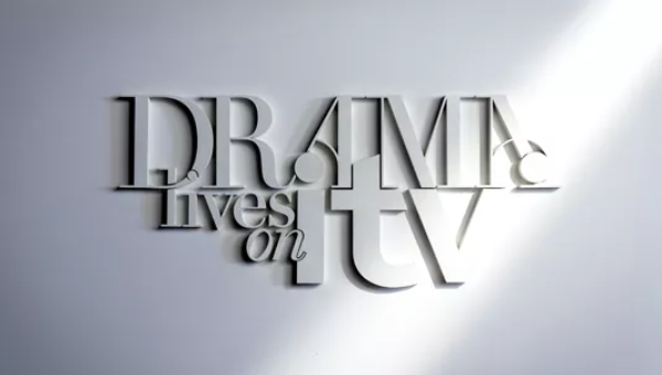
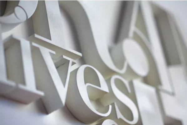
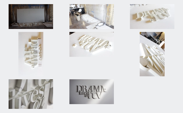
Pictures courtesy of Creative Bloq/Craig Ward
0 Comments
|
AuthorAlex Charnock Archives
December 2020
Categories |
 RSS Feed
